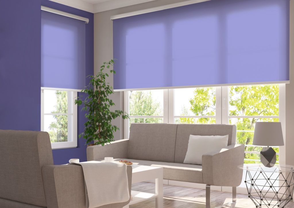
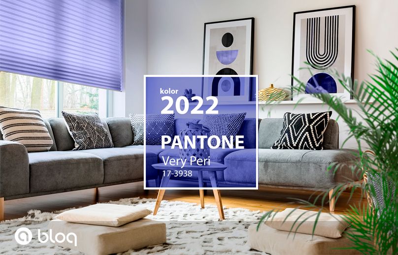
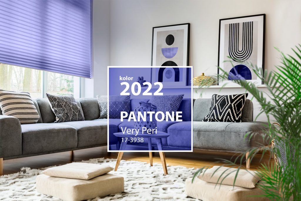
As every year around this time, the Pantone Institute chose the color of the year. The shade of the year 2022 will be Very Peri. The shade of purple sets next year’s trends, and at the same time conveys the symbolism associated with it.
The Pantone Institute has been setting the color of the coming year continuously since 1999. This is an important moment for interior decorators and fashion designers. The color automatically becomes a trend that is taken into account in many areas of life, including interior design.
The colors for 2021 were the “calming gray” of 17-5104 Ultimate Gray and the “sunny yellow” of 13-0647 Illuminating. The gray symbolized concrete foundations and rocky beaches, and thus a sense of peace that the pandemic world needed. Shades of yellow were associated with positive thinking and hope for a better future. The list of last year’s colors of the year was described by Pantone as: “A marriage of color conveying a message of strength and hopefulness that is both enduring and uplifting.”
Apart from setting trends, the Pantone Institute also perfectly describes the reality that surrounds us, noting exactly in which direction it is heading. It was no different this year. Vera Peri is a shade of purple that the institute has described as a reflection of the changes that the world is experiencing today. What exactly are these changes? On the institute’s website, we read:
“We are living in transformative times. PANTONE 17-3938 Very Peri is a symbol of the global zeitgeist of the moment and the transition we are going through. As we emerge from an intense period of isolation, our notions and standards are changing, and our physical and digital lives have merged in new ways. Digital design helps us to stretch the limits of reality, opening the door to a dynamic virtual world where we can explore and create new color possibilities. With trends in gaming, the expanding popularity of the metaverse and rising artistic community in the digital space PANTONE 17-3938 Very Peri illustrates the fusion of modern life and how color trends in the digital world are being manifested in the physical world and vice versa.” (Source: https://www.pantone.com/color-of-the-year-2022)
Jak kolor Very Peri ma się do rynku osłon okiennych? Czy kolorystyczny trend zawładnie także nimi?
“Very Peri is an interesting proposition, but we do not anticipate any dramatic shifts in the tastes of our Customers in terms of the color of fabrics for window covers,” says Anna Maria Brańka, Marketing Director at Akant. “Of course, we offer fabrics in colors similar to Very Peri, but experience shows that our customers prefer more neutral colors, which still match the interior design, even if it changes.
In the coming year, we will be closely monitoring the influence of the new color of the year on interior design trends.” Will it change the preferences of fans of design? Time will tell!
